| If there is one thing that consistently disappoints me in fan-made modules, it's lighting. Placed lights in particular. Therefore, I am going to give you a little tutorial on how to place lights and what the various options do, as well as some tips about how to make lights look good.
Before we begin: to any mod makers with less-than-great computers who have to play with lighting settings turned down, please turn them up when you test your mod, or have someone else test it for you with lighting options up. Good lights can make your mod look excellent, but bad lights can ruin areas.
So let's start.
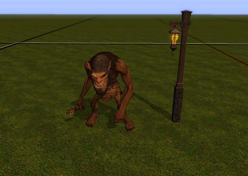
First, let's take a pretty simple scenario: we have a lamp post and an ogre, and we want the lamp post to cast a light.

So let's place a basic white light.

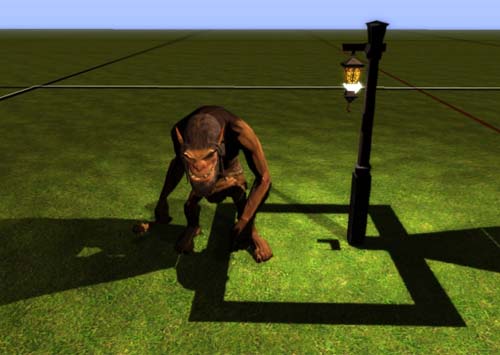
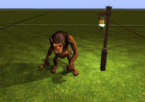
There we go ... what?? That looks awful! Sure, the lamp is casting light, but why are the shadows so dark? And what is that big ugly square on the ground?
What is that ugly square on the ground? That is the shadow of the lamp itself, and because the placed light is inside of the lamp, it is casting big huge ugly shadows.
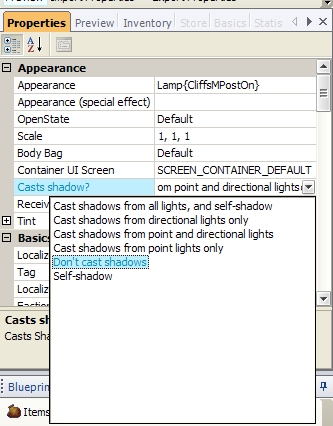
How do we fix that ugly square? You can do a few things. Well, you could move the light up or down, but chances are that the lamp will still cast big huge ugly shadows if the light is anywhere near it. There is a better solution! We are going to edit the lamp so that it does not cast shadows.
Go to the lamp's properties and click "Casts shadow?" There, you are presented with a variety of options. In this example, I clicked "don't cast shadows." However, you can set it so that it only casts shadow from point lights (i.e. lights you place), or directional light (i.e. the sun/moon), or both, or neither.

Now that we've done that, let's look at our ogre.

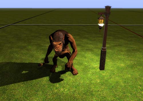
Isn't that much better? Now the big ugly shadows are gone, and only the ogre (and any other nearby creatures or placeables) will cast shadows from that light.
Why do this? Because we still want the light to cast shadows, and it looks good except often for placed object where the light comes from (lamp, torch, etc). By making that one object not cast shadows, we make the area look much better in general.
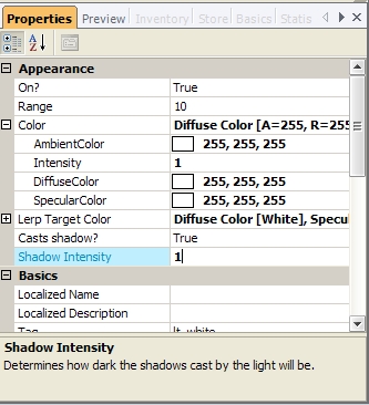
BUT WE'RE NOT DONE! There is still a problem with our ogre. The shadows are too dark. This is just a street-light - it's not as if the sun itself is placed mere feet away from the ogre's face. So we are going to adjust the shadow intensity.

I am going to set it to 0.5 for this example. Let's see what happens.

Original for comparison:

Isn't that pleasant? Now the shadow isn't so overbearing and doesn't totally shroud the ogre's left side in darkness.
Ok, now with the picture tutorial over, I am going to explain each lighting setting as best I can:
COLOR
Ambient color: not sure. Seemingly useless? Slight effect if anything.
Intensity: how bright the light is. Has no effect on shadows.
Diffuse color: the color of the light.
Specular color: Is the colour that you see when the light source reflects of something - firelight has an orange glow but only yellow light is refelected. Place some light above the terrain that has a reflective glint to check this out. As a rule, have the specular colour a few shades lighter than the diffuse colour. (from Wyrin_D'njargo)
LERP TARGET COLOR
I will get to lerp in a second.
Casts shadow? This determines whether the light casts shadows or not. More often than not, you should turn this off. Shadow casting lights, for one thing, hurt game performance. Secondly, too many shadow casting lights looks bad in an area. Thirdly, an area will look better when you only have a few (if any) shadow casting lights selectively placed for maximum dramatic effect.
Shadow intensity? How dark shadows are. This defaults to 1, which is pretty dark. Consider turning this down with most lights.
Behavior
Flicker: This is set to true or false. True means the light will flicker/fluctuate.
Flicker type: jumpy/bounce/linear. These are hard to explain in words, but play around with them to get a feeling for what they do. NOTE: "jumpy" flickers are how you get fireplace/torch effects.
Flicker rate: how quickly the light flickers. Higher number = faster (for good jumpy effects, you need a fairly high number).
Lerp: lerp if this is set to "true," then the light will shift between its main color and its "lerp" color (i.e. the lerp target color settings above).
Lerp period: how quickly the light changes from its main to its lerp color. |


